While you might have achieved some level of visualization in scRNA-seq data analysis, you may be unsure about how to analyze and compare multiple samples. For instance, you might want to integrate and plot control and stimulated groups in the same way.
This article introduces a method for integrating and analyzing scRNA-seq data from control and stimulated samples after batch effect correction. Once you can compare control and stimulated groups, you’ll be able to conduct comparative analyses for complex cell types. Let’s give it a try!
macOS Monterey (12.4), Quad-Core Intel Core i7, Memory 32GB seurat 4.3.0
Beginner-Friendly Technical Book on Single Cell RNA-seq Analysis Using Public Data Available for Sale
¥3,600 → ¥1,800 50%OFF!!
Easy-to-Understand Explanation for Programming Beginners!
Start Single Cell RNA-seq Analysis with R and Seurat!
Integration of scRNA-seq Data
Let’s discuss the following article about integrating scRNA-seq data, which is part of Seurat’s hands-on tutorial.
Integration of scRNA-seq Data
Seurat provides a method for analyzing two or more single-cell datasets by integrating them.
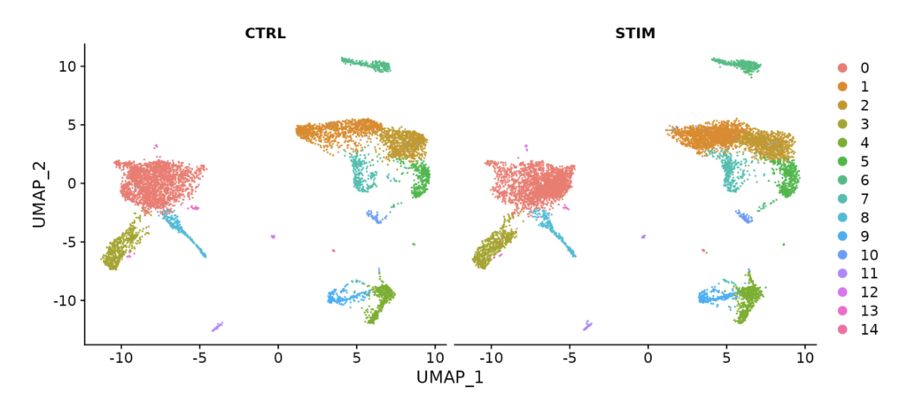
For example, by performing data integration as shown in the figure below, you can see that UMAP plots for control (CTRL) and stimulus (STIM) are nearly identical.
This integration allows you to compare and analyze different datasets effectively.
Using this integrated dataset, you can identify genes that are upregulated compared to the control for each gene. (The figure below shows an example with IFI6.)
https://satijalab.org/seurat/articles/integration_introduction
What is anchor?
An “anchor” is a part of the framework used to identify cell pairs that are biologically matched (or very similar) between different single-cell RNA sequencing (scRNA-seq) datasets. It relies on genes (features) that consistently vary across datasets. Such cell pairs share specific biological characteristics (e.g., particular cell types or expression patterns) consistently across multiple conditions, time points, or experiments. Anchors serve several roles:
- Batch Effect Correction: When integrating data from different conditions or experiments, there is a possibility of technical differences (known as batch effects). Anchors help recognize and correct these batch effects.
- Relative Interpretation: Anchors are useful for evaluating relative changes in gene expression across different datasets or conditions (e.g., before and after stimulation).
- Biological Insights: Accurately identifying anchors can provide insights into how cell populations transition or how cells relate to each other biologically.
Integration and Batch Effect Correction of scRNA-seq Datasets
Now, let’s introduce the implementation of integrating scRNA-seq data after batch effect correction.
First, we will create a Seurat object. In this example, we will install and load a dataset called “ifnb” using the SeuratData package.
library(Seurat)
library(SeuratData)
library(patchwork)
# install dataset
InstallData("ifnb")
# load dataset
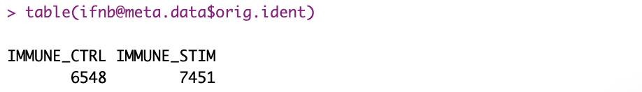
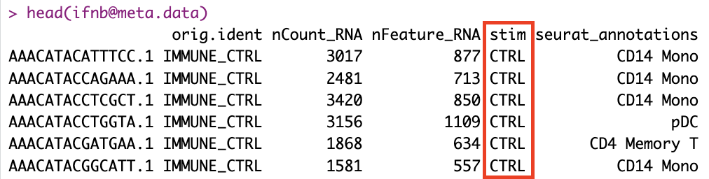
LoadData("ifnb")The “ifnb” dataset contains two experimental runs: “IMMUNE_CTRL” and “IMMUNE_STIM”. The “orig.ident” column is used to indicate the original sample or run for each cell.
This code performs preprocessing to obtain more accurate results for subsequent analyses such as clustering and gene expression comparisons. Additionally, it prepares the data effectively for integrating multiple datasets.
# split the dataset into a list of two seurat objects (stim and CTRL)
ifnb.list <- SplitObject(ifnb, split.by = "stim")

# normalize and identify variable features for each dataset independently
ifnb.list <- lapply(X = ifnb.list, FUN = function(x) {
    x <- NormalizeData(x)
    x <- FindVariableFeatures(x, selection.method = "vst", nfeatures = 2000)
})

# select features that are repeatedly variable across datasets for integration
features <- SelectIntegrationFeatures(object.list = ifnb.list)
The code explanation is as follows:
SplitObject(ifnb, split.by = "stim"): This command splits the Seurat object named ifnb, which contains single-cell RNA-seq data, into two separate Seurat objects based on the “stim” column in the meta.data (metadata), which represents the stimulation condition. This allows for the independent analysis of data for each stimulation condition.
lapply(...): The lapply function is used to apply the following operations to each Seurat object (data for each stimulation condition):
NormalizeData(x): Normalizes the data, which is done by scaling the counts for each cell based on the total amount of RNA. This ensures that the data is on a similar scale, making it suitable for downstream analysis.
FindVariableFeatures(x, selection.method = "vst", nfeatures = 2000): Identifies variable features (genes) for each dataset. Variable features are those genes that exhibit the most variation across cells, and this step is crucial for focusing on informative genes.
SelectIntegrationFeatures(object.list = ifnb.list): This step selects features (genes) that consistently show variation across datasets, which is important for effective data integration.
As for the question of why the Seurat object is split initially, there are several reasons for this:
- Understanding dataset characteristics: Each stimulation condition (in this case, stimulated or unstimulated) may lead to different cell responses. To understand these differences, it is necessary to analyze each condition independently. Independent analysis helps identify condition-specific variable genes and cell clusters.
- Batch effect correction: Performing independent analysis for each condition allows for more effective batch effect correction during the later integration phase. This is particularly important when the data for each condition comes from different experimental settings.
- Advanced comparative analysis: Analyzing each condition as independent objects enables more advanced comparative analyses, including differential gene expression and differences in cell clusters between conditions.
- Integration accuracy: Seurat’s integration methods involve finding “anchors” (points that correspond to equivalent cell states) using selected variable genes from each dataset (in this case, each condition). This process relies on independently preprocessed information from each dataset.
For these reasons, it is common to split the data into independent objects, perform preprocessing and basic analysis on each, and then proceed with integration.
Next, the code uses anchors to integrate two datasets. This code is responsible for integrating multiple scRNA-seq datasets and removing batch effects.
# Find integration ancher
immune.anchors <- FindIntegrationAnchors(object.list = ifnb.list, anchor.features = features)

# this command creates an 'integrated' data assay
immune.combined <- IntegrateData(anchorset = immune.anchors)
FindIntegrationAnchors(object.list = ifnb.list, anchor.features = features): This function identifies “anchors,” which are pairs of cells that match between different scRNA-seq datasets. It does so based on the specified features (variable genes).object.list = ifnb.list: This argument takes a list of Seurat objects that you want to integrate (in this case,ifnb.list).anchor.features = features: This argument specifies the list of features (genes) to use for integration. These are typically genes that exhibit significant variation across multiple datasets.
IntegrateData(anchorset = immune.anchors): This command integrates the datasets into one “integrated” data assay using the anchors identified in the previous step.anchorset = immune.anchors: This argument includes the anchors identified in the previous step.
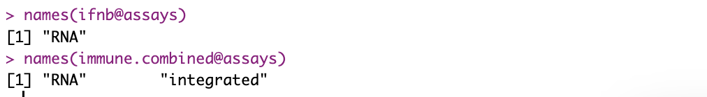
In the case of the ifnb dataset, both conditions (IMMUNE_CTRL and IMMUNE_STIM) exist within the same Seurat object, but integration has not been performed at this stage. The Seurat object ‘immune.combined’ has a new “integrated” assay created, where the integrated data is stored.
At the ifnb object stage, there is only the “RNA” assay, indicating that the two dataset conditions have not been integrated into a single Seurat object.
Next, we move on to downstream analysis with the integrated dataset.
To start, the following code sets the DefaultAssay to “integrated.” This code sets the default assay to “integrated” in the ‘immune.combined’ Seurat object, specifying that the subsequent analysis will target this integrated data.
DefaultAssay(immune.combined) <- "integrated"DefaultAssayis a function used to retrieve or set the default assay (a specific view of the dataset) within a Seurat object.immune.combinedis a Seurat object that typically contains a collection of single-cell RNA-seq data or integrated datasets.<- "integrated"sets the default assay of the ‘immune.combined’ object to “integrated.” The “integrated” assay refers to the data after integrating information from multiple samples or conditions. This allows users to proceed with their analysis based on the integrated data.
We will proceed with the downstream processing. We are using the magrittr library and processing steps as usual with the %>% operator in Seurat, so I will skip the detailed explanation of preprocessing steps.
library(magrittr) # Load the magrittr package for the %>% operator
# Now you can use the pipe operator
immune.combined <- immune.combined %>%
ScaleData(verbose = FALSE) %>%
RunPCA(npcs = 30, verbose = FALSE) %>%
RunUMAP(reduction = "pca", dims = 1:30) %>%
FindNeighbors(reduction = "pca", dims = 1:30) %>%
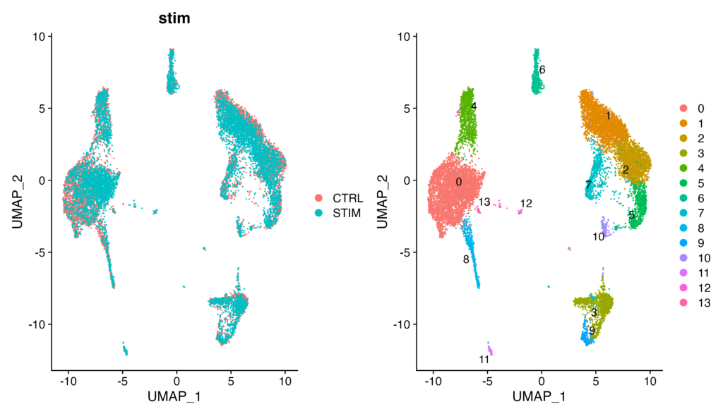
FindClusters(resolution = 0.5)Let’s proceed to visualize UMAP. To make a comparison between the integrated and non-integrated datasets, we will output UMAP plots for both immune.combined (the integrated dataset) and ifnb (the non-integrated dataset).
# Visualization
p1 <- DimPlot(immune.combined, reduction = "umap", group.by = "stim")
p2 <- DimPlot(immune.combined, reduction = "umap", label = TRUE, repel = TRUE)
p1 + p2
When using the immune.combined dataset for visualization (the integrated dataset)
When using the ifnb dataset for visualization (the non-integrated dataset)
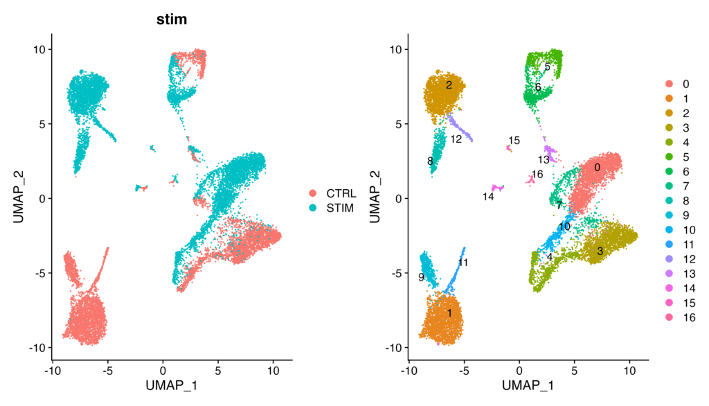
As you can see, in the ifnb dataset, on the left UMAP plot, CTRL and STIM are not overlapping at all. Consequently, in the clustering results on the left, clusters that could be expected to belong to the same cell population (e.g., 0 and 3) are detected separately, making the analysis uncertain. I hope you now understand the importance of integration processing.
By the way, by specifying split.by = "stim", you can combine the plots for CTRL and STIM.
DimPlot(immune.combined, reduction = "umap", split.by = "stim")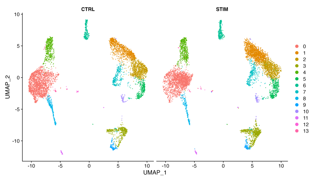
Before moving on to the next section, let’s assign cell types to each cluster. (We will skip the specific identification of cell types and marker genes in this tutorial.)
immune.combined <- RenameIdents(immune.combined, `0` = "CD14 Mono", `1` = "CD4 Naive T", `2` = "CD4 Memory T",
                                `3` = "CD16 Mono", `4` = "B", `5` = "CD8 T", `6` = "NK", `7` = "T activated", `8` = "DC", `9` = "B Activated",
                                `10` = "Mk", `11` = "pDC", `12` = "Eryth", `13` = "Mono/Mk Doublets", `14` = "HSPC")
DimPlot(immune.combined, label = TRUE)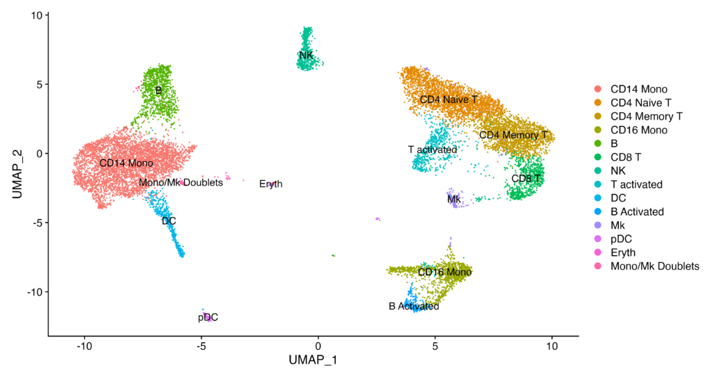
Identifying Differentially Expressed Genes between Conditions
Let’s now compare the control group and the stimulation group.
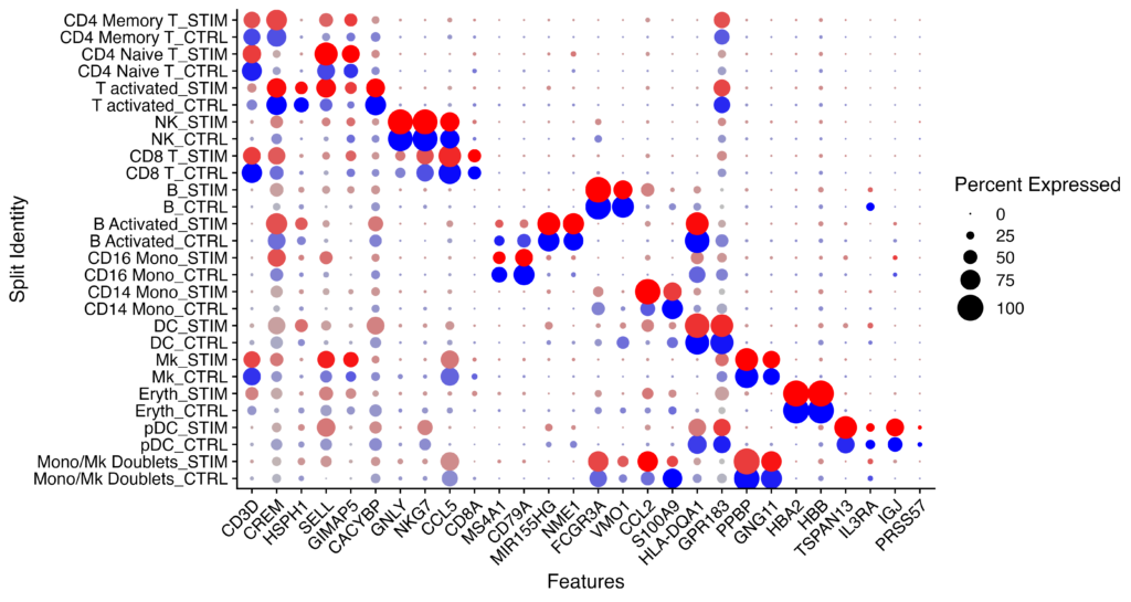
This code is used to visualize the expression levels of specific marker genes based on different clusters or categories.
Idents(immune.combined) <- factor(Idents(immune.combined), levels = c("HSPC", "Mono/Mk Doublets","pDC", "Eryth", "Mk", "DC", "CD14 Mono", "CD16 Mono", "B Activated", "B", "CD8 T", "NK", "T activated","CD4 Naive T", "CD4 Memory T"))
markers.to.plot <- c("CD3D", "CREM", "HSPH1", "SELL", "GIMAP5", "CACYBP", "GNLY", "NKG7", "CCL5","CD8A", "MS4A1", "CD79A", "MIR155HG", "NME1", "FCGR3A", "VMO1", "CCL2", "S100A9", "HLA-DQA1","GPR183", "PPBP", "GNG11", "HBA2", "HBB", "TSPAN13", "IL3RA", "IGJ", "PRSS57")
DotPlot(immune.combined, features = markers.to.plot, cols = c("blue", "red"), dot.scale = 8, split.by = "stim") +
  RotatedAxis()
The Idents function is used to retrieve the current cluster IDs or other identity information from the Seurat object. This line reorders the identities of immune.combined to control the display order in later plots.
In the markers.to.plot section, you define the list of marker genes that you want to plot.
If the DotPlot generates the expected output, you should see comparisons between CTRL and STIM for each cell in rows and the genes in columns.
Next, we will identify genes that show differential expression between conditions.
This code is used to visually compare the differences in gene expression between stimulated cells and control cells. Specifically, it compares the expression of genes between naive T cells and CD14 monocyte populations, highlighting specific genes that indicate a response to interferon stimulation using a scatter plot.
# Load visualization libraries
library(ggplot2)
library(cowplot)
theme_set(theme_cowplot())

# Extract and process data for "CD4 Naive T" cells
t.cells <- subset(immune.combined, idents = "CD4 Naive T")
Idents(t.cells) <- "stim"
avg.t.cells <- as.data.frame(log1p(AverageExpression(t.cells, verbose = FALSE)$RNA))
avg.t.cells$gene <- rownames(avg.t.cells)

# Extract and process data for "CD14 Mono" cells
cd14.mono <- subset(immune.combined, idents = "CD14 Mono")
Idents(cd14.mono) <- "stim"
avg.cd14.mono <- as.data.frame(log1p(AverageExpression(cd14.mono, verbose = FALSE)$RNA))
avg.cd14.mono$gene <- rownames(avg.cd14.mono)

# Specify genes to be highlighted in plots
genes.to.label = c("ISG15", "LY6E", "IFI6", "ISG20", "MX1", "IFIT2", "IFIT1", "CXCL10", "CCL8")

# Create scatter plots and label specified genes
p1 <- ggplot(avg.t.cells, aes(CTRL, STIM)) + geom_point() + ggtitle("CD4 Naive T Cells")
p1 <- LabelPoints(plot = p1, points = genes.to.label, repel = TRUE)
p2 <- ggplot(avg.cd14.mono, aes(CTRL, STIM)) + geom_point() + ggtitle("CD14 Monocytes")
p2 <- LabelPoints(plot = p2, points = genes.to.label, repel = TRUE)

# Display plots side by side
p1 + p2
The flow of the code is as follows:
- Obtain the average gene expression values for stimulated naive T cells and control CD14 monocyte populations.
- Use the ggplot2 and cowplot packages to plot the gene expression of these two cell types.
- Emphasize and label specific genes (e.g., ISG15, LY6E) in the plot.
- Finally, display the two plots side by side.
If you see a scatterplot like the one below, you have successfully executed the code.

The following code performs cell type identification based on the stimulation state, identifies differentially expressed genes, and visualizes the expression levels of specific genes using Feature plots on the single-cell RNA-seq dataset “immune.combined”.
# Create a new identifier combining cell type and stimulation status
immune.combined$celltype.stim <- paste(Idents(immune.combined), immune.combined$stim, sep = "_")
# Backup current cell type identifiers and update to the new combined identifier
immune.combined$celltype <- Idents(immune.combined)
Idents(immune.combined) <- "celltype.stim"
# Identify genes differentially expressed between stimulated and control B cells
b.interferon.response <- FindMarkers(immune.combined, ident.1 = "B_STIM", ident.2 = "B_CTRL", verbose = FALSE)
# Visualize expression of selected genes split by stimulation status
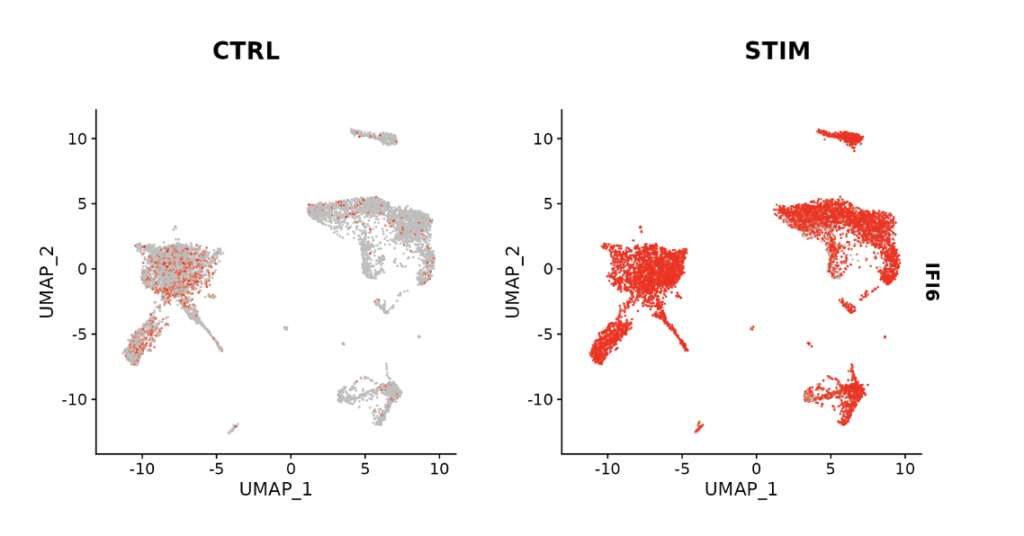
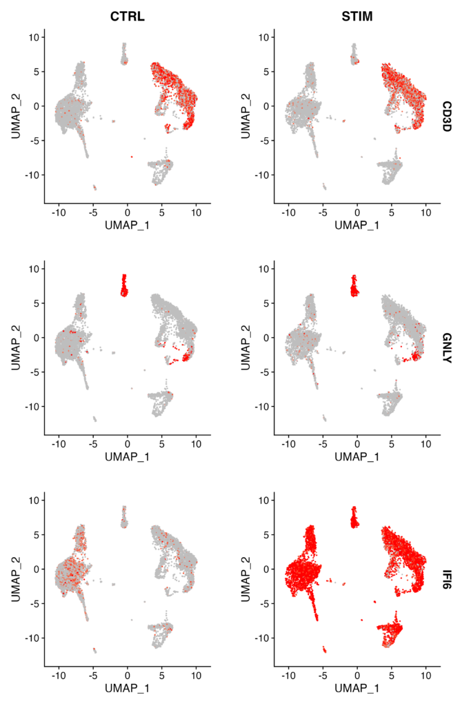
FeaturePlot(immune.combined, features = c("CD3D", "GNLY", "IFI6"), split.by = "stim", max.cutoff = 3, cols = c("grey", "red"))
- Create a new identifier by combining cell type and stimulation state in
immune.combined$celltype.stim. - Backup the current cell type information and update it with the new combined identifier.
- Utilize the
FindMarkersfunction to identify genes that are differentially expressed between stimulated B cells and control B cells. - Visualize the expression of selected genes (CD3D, GNLY, IFI6) based on the stimulation state using the
FeaturePlotfunction.
Success is achieved when you obtain Feature plots like the one below. It’s instantly clear which clusters show expression variation between CTRL and STIM conditions (in this case, IFI6).
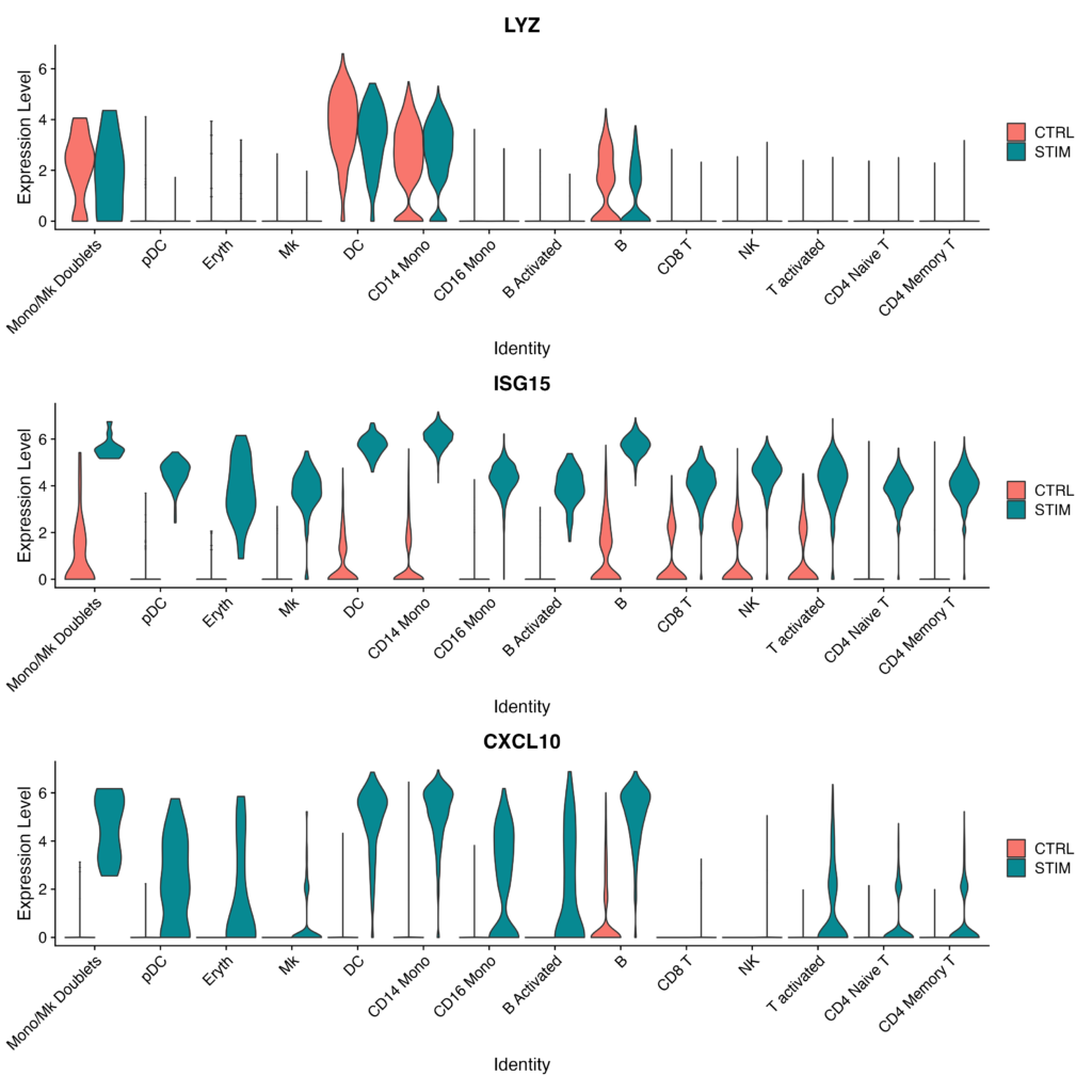
Finally, let’s visualize gene expression for each cell type using violin plots.
# Generate violin plots for specified genes, separated by stimulation status and grouped by cell type
plots <- VlnPlot(immune.combined, features = c("LYZ", "ISG15", "CXCL10"), split.by = "stim", group.by = "celltype",
                 pt.size = 0, combine = FALSE)

# Display the generated plots in a single column layout
wrap_plots(plots = plots, ncol = 1)
- Create violin plots for the specified genes (LYZ, ISG15, CXCL10). These plots will be segmented by stimulation state and grouped by cell type.
- Display the generated violin plots in a single-row layout.
Success is achieved when the output appears as follows, clearly visualizing the increase in Expression Level of ISG15 and CXCL10 in the post-stimulation samples for each cell type.
In Conclusion
How did it go? Being able to perform comparative analysis on complex cell types in scRNA-seq data between control and stimulated samples greatly expands the scope of your analysis. I encourage you to give it a try!

Beginner-Friendly Technical Book on RNA-seq Analysis Using Public Data Available for Sale
¥2,500 → ¥1,500 40%OFF!!
An easy-to-understand guide with abundant screen captures!
Start Dry Research from Your Home PC